4 7 Basic Quality Tools
4.1 Learning Outcomes
By the end of this chapter, you should be able to:
- Identify and explain the seven basic quality tools (7QC tools).
- Apply each tool to analyze, monitor, and improve processes.
- Construct and interpret quality tools (check sheet, Pareto, histogram, etc.).
- Use quality tools to support process improvement and decision-making.
4.2 Introduction
The seven basic tools of quality are a powerful collection of problem-solving techniques.
They are useful in achieving process stability and improving capability through reduction of variability.
The seven tools include:
1. Check Sheet
2. Pareto Chart
3. Run and Control Charts
4. Cause-and-Effect (Fishbone) Diagram
5. Histogram
6. Scatter Diagram
7. Flow Chart
Note
Key Idea: These tools are called basic because they can be used by almost anyone in the organization, not just quality engineers.
4.3 Check Sheet
A check sheet is one of the simplest tools used in the early stages of process improvement. A check sheet is a structured form used to collect and record data in real time. It helps classify defects, problems, or events as they occur, so that patterns can be analyzed later.
4.3.0.1 Features
Categories of defects/problems are predefined.
Tallies (marks) are recorded during inspection or service.
Totals are calculated after data collection.
Easy to use at the shop floor, service counters, or during audits.
Purpose: To collect historical or current operating data about a process.
Advantages:
- Simplifies data collection and analysis.
- Highlights problem areas by frequency of defect, location, or cause.
Design considerations: Clearly specify the type of data to be collected, part number, operation, date, analyst, and any other useful information.
Tip
Remember: A check sheet is not analysis by itself—it is a data collection tool. Interpretation comes after tallying results.
4.3.0.2 Example — Completed Check Sheet
Scenario
An inspector recorded defects during the inspection of 20 bottled drinks.
Raw Inspection Data (extract)
| Bottle No. | Defect |
|---|---|
| 1 | Wrong label |
| 2 | Leaking cap |
| 3 | Underfill |
| … | … |
Completed Check Sheet
| Defect Type | Tally | Total |
|---|---|---|
| Leaking cap | ||
| Wrong label | ||
| Broken bottle | ||
| Underfill | ||
| Overfill | ||
| Total | 20 |
How to Interpret the Check Sheet:
- Identify most frequent defect:
- Leaking cap = 9 → this is the biggest problem.
- Identify least frequent defects:
- Broken bottle, Underfill, Overfill = 2 each → lower priority.
- Calculate percentages (optional):
- Leaking cap: 9/20 = 45%
- Wrong label: 7/20 = 35%
- Others (2 each): 10% each
- Decision-making:
- Focus improvement on Leaking caps first, since nearly half of all defects are due to this issue.
- Wrong labels also need attention, while the other three categories are less critical for now.
- Focus improvement on Leaking caps first, since nearly half of all defects are due to this issue.
Note
👉 Key Point:
A check sheet makes patterns clear at a glance → instead of scattered notes, you instantly see which defect dominates. This sets the stage for the Pareto chart in the next session.
4.3.0.3 Exercise — Check Sheet
Objective: Practice designing, using, and interpreting a check sheet.
Step 1: Prepare the Check Sheet
You are a supervisor in a bottled drink production line.
Common defects are:
Leaking cap
Wrong label
Broken bottle
Underfill
Overfill
Design a check sheet with defect categories, tally marks, and totals.
Step 2: Inspection Data
During a shift, 20 bottles were inspected with the following results:
| Bottle No. | Defect |
|---|---|
| 1 | Wrong label |
| 2 | Leaking cap |
| 3 | Underfill |
| 4 | Leaking cap |
| 5 | Overfill |
| 6 | Wrong label |
| 7 | Leaking cap |
| 8 | Broken bottle |
| 9 | Leaking cap |
| 10 | Wrong label |
| 11 | Leaking cap |
| 12 | Underfill |
| 13 | Overfill |
| 14 | Wrong label |
| 15 | Leaking cap |
| 16 | Broken bottle |
| 17 | Wrong label |
| 18 | Leaking cap |
| 19 | Leaking cap |
| 20 | Wrong label |
Step 3: Complete the Check Sheet
Template (fill with tallies and totals):
| Defect Type | Tally | Total |
|---|---|---|
| Leaking cap | ||
| Wrong label | ||
| Broken bottle | ||
| Underfill | ||
| Overfill | ||
| Total |
Step 4: Answer the Questions
- Fill in the tally marks and totals for each defect type.
- Which defect occurred most frequently?
- Which defect occurred least frequently?
- Calculate the percentage of each defect type.
- Explain why a check sheet is a useful first step before creating a Pareto chart.
4.4 Pareto Chart
The Pareto principle (80/20 rule) was popularized by Juran: 80% of problems are often caused by 20% of factors.
Purpose: Rank causes of problems by frequency.
Structure: Histogram + cumulative percentage line.
Application: Helps prioritize the most significant issues.
A Pareto chart ranks problem categories (e.g., defect types, complaint reasons) from highest to lowest frequency and overlays the cumulative percentage. It is based on the Pareto principle (80/20 rule): a few causes (the vital few) account for most of the effect, while many causes (the useful many) contribute far less.
Why use it
Focus limited resources on the biggest impact items first.
Makes priorities visible and defensible to management.
Forms the bridge from Check Sheet → Pareto → Root cause (Fishbone).
When to use
After collecting categorical counts (e.g., via a check sheet).
When you must prioritize among many causes.
Before investing time in deeper analysis.
Data needed
A list of categories and their counts over a defined period.
(Optional) weights such as cost, time lost, RM impact for a weighted Pareto.
How to construct (steps)
1. List categories and their counts (from a check sheet).
2. Sort categories descending by count.
3. Compute cumulative counts and cumulative %
\[
\mathrm{Cum\%}_i \;=\;
\frac{\sum_{k=1}^{i} \mathrm{Count}_k}{\sum_{k=1}^{n} \mathrm{Count}_k}\times 100\%
\] 4. Draw bars (left→right, tallest to shortest) and a cumulative % line.
5. Read off the 80% point to separate vital few from useful many.
6. Translate findings into actions (owner, timeline, next tool = Fishbone).
Quick example of the table you build before plotting
| Category | Count | Cum Count | Cum % |
|---|---|---|---|
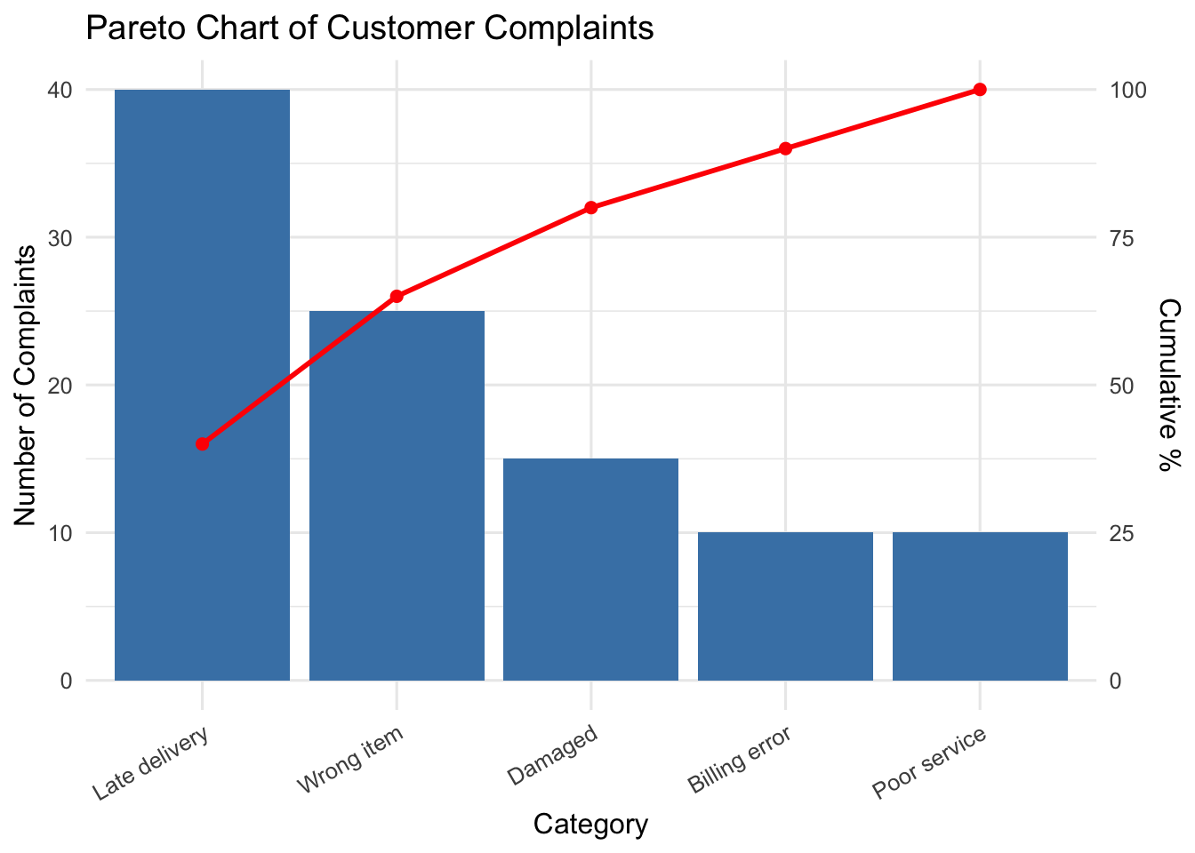
| Late delivery | 40 | 40 | 40% |
| Wrong item | 25 | 65 | 65% |
| Damaged product | 15 | 80 | 80% |
| Billing error | 10 | 90 | 90% |
| Poor service | 10 | 100 | 100% |
How to interpret
- Identify the few categories that push the cumulative line up to about 80%.
- Start improvement there (largest, most correctable, highest cost impact).
- Rebuild the Pareto after actions to verify improvement.
Common pitfalls
- Overlapping categories (double counting) → define categories clearly.
- Too little data (short period) → risk of noise; extend time window.
- Mixing levels (root cause + symptom) → keep one level per chart.
- Ignoring stratification (shift, line, customer) → consider separate Paretos.
Useful variations
- Weighted Pareto (by cost, RM, minutes lost) to capture impact, not just frequency.
- Time-slice Pareto (before/after) to show improvement.
- Stacked Pareto for quick stratification (e.g., by shift).
4.4.1 Example
A company records the following types of customer complaints in one month:
| Complaint Type | Frequency |
|---|---|
| Late delivery | 40 |
| Wrong item | 25 |
| Damaged product | 15 |
| Billing error | 10 |
| Poor customer service | 10 |
Task: Construct a Pareto chart and interpret the results.
📘 Answer & Interpretation:
- The Pareto chart shows Late delivery (40) and Wrong item (25) together account for ~65% of all complaints.
- Following the 80/20 rule, the company should focus first on improving delivery times and order accuracy.
- Fixing these two issues will solve the majority of customer dissatisfaction.
4.4.2 Exercise 1
A factory recorded defects in 100 products during inspection:
| Defect Type | Frequency |
|---|---|
| Scratches | 45 |
| Dents | 25 |
| Missing parts | 15 |
| Color mismatch | 15 |
Task for Students:
1. Construct a Pareto chart for the defects.
2. Identify which two defect types should be addressed first.
3. Interpret the results using the 80/20 principle.
TipSolution
Answer & Interpretation:
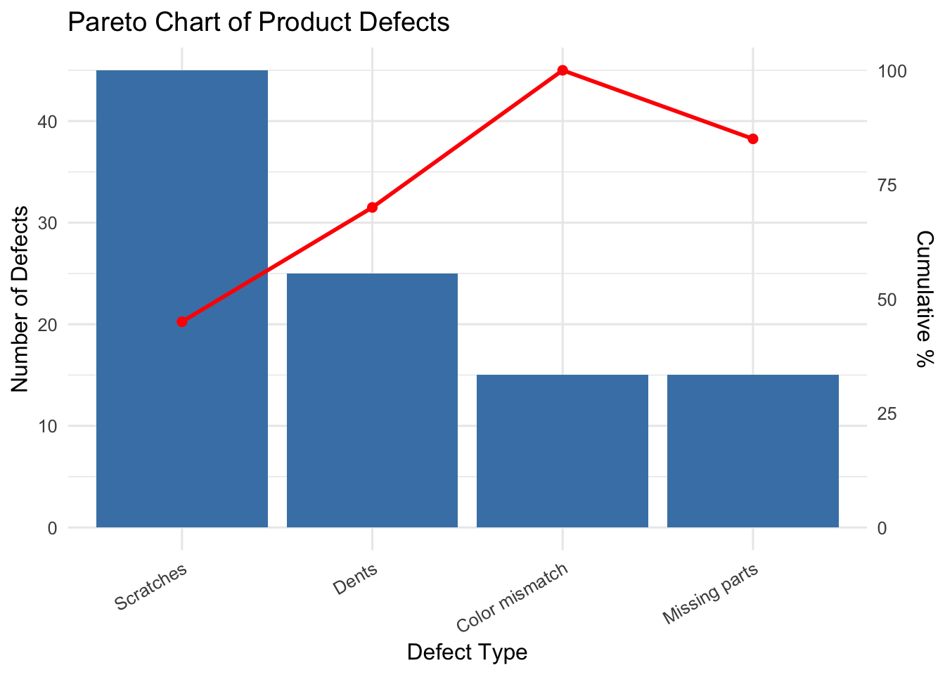
- The two largest categories are Scratches (45) and Dents (25) → together they account for 70% of defects.
- According to the Pareto principle, focusing on reducing scratches and dents will yield the greatest improvement.
- Once these are reduced, attention can shift to less frequent issues (missing parts, color mismatches).
4.4.3 Exercise 2
Question:
A restaurant collected customer complaints through comment cards. The data are:
| Code | Complaint | Frequency |
|---|---|---|
| A | Dirty Dishes | 16 |
| B | Dirty Silverware | 56 |
| C | Inattentive Service | 136 |
| D | Cold Food | 80 |
| E | Wrong Order | 12 |
| F | Overpaid | 100 |
| Total | 400 |
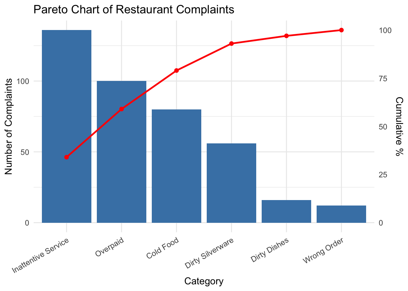
Construct a Pareto chart and explain which problems should be investigated first.
TipSolution
Answer & Interpretation:
-Scratches + Dents (70%) represent the vital few problems.
-According to the Pareto principle, addressing these two will eliminate most defects.
-Focus improvement on preventing scratches and dents (e.g., packaging, handling, storage).
4.5 Histogram
A histogram is a bar graph that shows the frequency distribution of data.
It helps visualize how values are spread, whether the process is stable, and whether patterns like skewness or outliers exist.
4.5.0.1 Features
- Data are grouped into intervals (bins).
- Bars represent the frequency of observations in each interval.
- Useful for analyzing variability, central tendency, and spread.
4.5.0.2 Advantages
- Easy visualization of process behavior.
- Helps detect unusual patterns (e.g., skew, bimodal).
- Basis for deciding if process improvement is needed.
4.5.0.3 Example — Exam Scores
A class of 30 students had their test scores recorded (out of 100):
45, 50, 52, 53, 55, 56, 57, 58, 60, 60, 62, 63, 65, 65, 66, 67, 68, 70, 72, 73, 74, 75, 76, 78, 80, 82, 83, 85, 88, 90
Step 1 — Group into intervals (bins of 10 marks):
| Interval | Frequency |
|---|---|
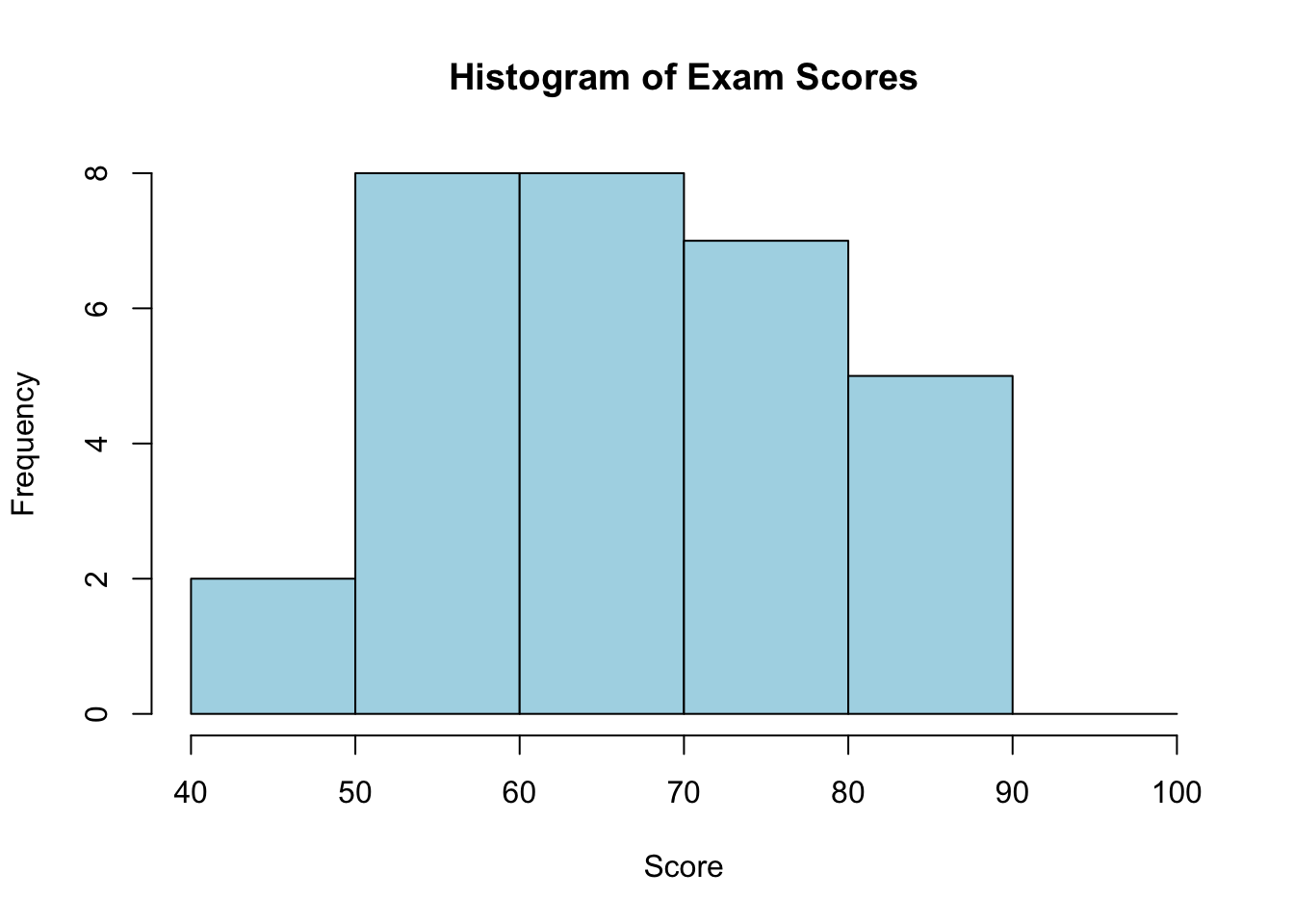
| 40–49 | 1 |
| 50–59 | 7 |
| 60–69 | 9 |
| 70–79 | 7 |
| 80–89 | 5 |
| 90–99 | 1 |
Step 2 — Histogram (Conceptual Representation)
4.5.0.4 Interpretation
- Most students scored between 60–69 marks (9 students).
- Distribution is roughly bell-shaped, slightly skewed to the right.
- Only 1 low score (45) and 1 very high score (90).
- Suggests overall performance is satisfactory, but there is room to push more students above 80.
Tip
The histogram allows instructors to visualize class performance and identify where most students lie, whether results are consistent, and whether interventions are needed.
4.5.1 Histogram with Tolerance Limits
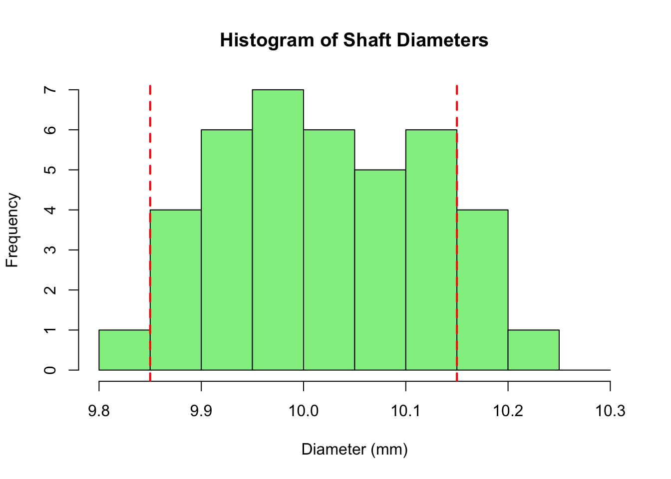
In quality control, histograms are often used to compare data against tolerance limits (specifications set by the customer or industry).
If too many observations fall outside the limits, the process is considered out of control.
4.5.1.1 Example — Shaft Diameter
A machine produces steel shafts.
The design specification (tolerance limits) requires shaft diameters to be within:
- Lower Specification Limit (LSL) = 9.85 mm
- Upper Specification Limit (USL) = 10.15 mm
A sample of 40 shafts was measured (in mm):
9.83, 9.87, 9.88, 9.89, 9.90, 9.91, 9.92, 9.93, 9.94, 9.95, 9.95, 9.96, 9.97, 9.97, 9.98, 9.99, 10.00, 10.00, 10.01, 10.02, 10.03, 10.04, 10.04, 10.05, 10.06, 10.07, 10.08, 10.09, 10.10, 10.11, 10.12, 10.13, 10.14, 10.14, 10.15, 10.16, 10.17, 10.18, 10.20, 10.21
4.5.1.2 Create Histogram with Limits
Step 2 — Interpretation
-The majority of shafts fall between 9.90 mm and 10.10 mm, well within tolerance.
-A few values (e.g., 9.83, 10.20, 10.21) fall outside the limits.
-This suggests the process is generally capable, but some adjustments or monitoring may be required to reduce defects.
4.5.2 Exercise 1
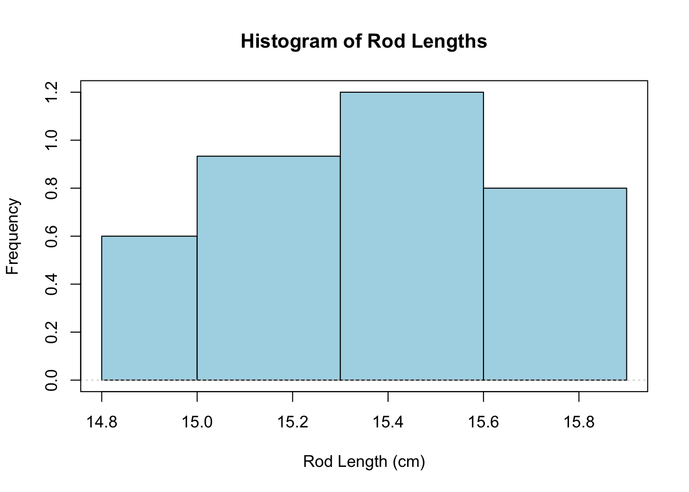
A workshop measured the lengths of 50 metal rods.
The grouped frequency distribution is shown below:
| Length Interval (cm) | Frequency |
|---|---|
| 14.8 – 15.0 | 6 |
| 15.1 – 15.3 | 14 |
| 15.4 – 15.6 | 18 |
| 15.7 – 15.9 | 12 |
Task for Students:
1. Plot the histogram using the grouped data.
2. Shade the bars in the blank graph below.
3. Identify which class interval has the highest frequency.
TipSolution
Interpretation:
- The histogram shows that the 15.4–15.6 cm interval has the highest frequency (18 rods).
- Most rods cluster around the mid-range (15.1–15.6 cm).
- The distribution is fairly symmetric, with fewer rods at the shorter and longer ends.
4.5.3 Exercise 2
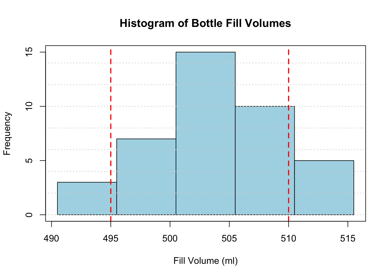
A bottling plant fills 500 ml soft drink bottles. A sample of 40 bottles was taken and grouped as follows:
| Fill Volume (ml) | Frequency |
|---|---|
| 490–494 | 3 |
| 495–499 | 7 |
| 500–504 | 15 |
| 505–509 | 10 |
| 510–514 | 5 |
Tasks for Students:
- Draw a histogram of the data.
- Add the specification limits at 495 ml and 510 ml.
- Comment on whether the process appears capable of meeting specifications.
TipSolution
4.6 Cause-and-Effect Diagram (Fishbone)
A cause-and-effect diagram (also called a fishbone or Ishikawa diagram) helps teams brainstorm and categorize potential causes of a problem.
It organizes ideas into categories that branch from the main “spine” leading to the effect (problem).
Why use it - To explore all possible causes of a problem systematically.
- To encourage team brainstorming and prevent overlooking factors.
- To structure causes into categories that can later be verified with data.
When to use - After a Pareto chart identifies a major problem category.
- When the cause of a problem is unclear.
- In team root cause analysis sessions.
How to construct
1. Define the problem (effect) clearly and place it at the head of the fish.
2. Draw the spine (horizontal arrow).
3. Identify major cause categories (commonly the 6M for manufacturing:
Man, Machine, Method, Material, Measurement, Mother Nature/Environment).
4. Brainstorm specific causes under each category.
5. Review the diagram to select causes for deeper analysis or testing.
Common pitfalls
- Treating brainstormed causes as facts without verification.
- Using too few categories (important factors may be missed).
- Confusing symptoms with root causes.
4.6.1 Example
A factory reports a high defect rate in product assembly. The quality team constructs a fishbone diagram to explore possible causes.
flowchart LR
    Effect["High Defect Rate in Assembly"]:::effect

    subgraph M1["Man"]
        M1a["Inadequate training"]
        M1b["Fatigue / overtime"]
    end

    subgraph M2["Machine"]
        M2a["Worn-out tools"]
        M2b["Irregular maintenance"]
    end

    subgraph M3["Method"]
        M3a["No standardized process"]
        M3b["Incorrect work sequence"]
    end

    subgraph M4["Material"]
        M4a["Poor supplier quality"]
        M4b["Incorrect material spec"]
    end

    subgraph M5["Measurement"]
        M5a["Inaccurate gauges"]
        M5b["Inconsistent inspection"]
    end

    subgraph M6["Environment"]
        M6a["Dust in work area"]
        M6b["High temperature"]
    end

    M1 --> Effect
    M2 --> Effect
    M3 --> Effect
    M4 --> Effect
    M5 --> Effect
    M6 --> Effect

    classDef effect fill=#f9f,stroke=#333,stroke-width=2px;
Answer & Interpretation
- The diagram highlights that training, tool condition, and supplier quality are possible drivers of the defect rate.
- Next step: collect data to test which causes are significant (e.g., compare defect rate by operator, by supplier lot).
4.6.2 Student Exercise
A customer service department faces a problem of high complaint resolution time.
Task for Students
1. Draw a fishbone diagram for the problem.
2. Use at least 5 categories (e.g., People, Process, Technology, Policy, Environment).
3. Suggest at least 2 causes under each category.
TipSolution (Sample Fishbone)
Interpretation
- Likely key factors: staff experience and system speed.
- Action: invest in training, improve CRM performance, and simplify escalation workflow.
4.7 Scatter Diagram
A scatter diagram plots two variables on a Cartesian plane to show their relationship.
It helps determine whether changes in one variable are associated with changes in another.
Why use it
- To detect correlation between variables (positive, negative, or none).
- To explore possible cause–effect links before deeper analysis.
- To support regression analysis or control charts.
When to use
- After measurement data for two variables is available.
- When you suspect that X influences Y.
- As a diagnostic tool to guide problem-solving teams.
How to construct
1. Collect paired data (X and Y).
2. Plot each pair as a point on the graph.
3. Visually inspect the pattern:
- Positive correlation → points rise together.
- Negative correlation → one rises as the other falls.
- No correlation → random scatter.
4. (Optional) Fit a line/trend using correlation or regression.
Common pitfalls
- Assuming correlation = causation.
- Too small a dataset (random noise may mislead).
- Hidden third variables influencing both X and Y.
4.7.1 Example
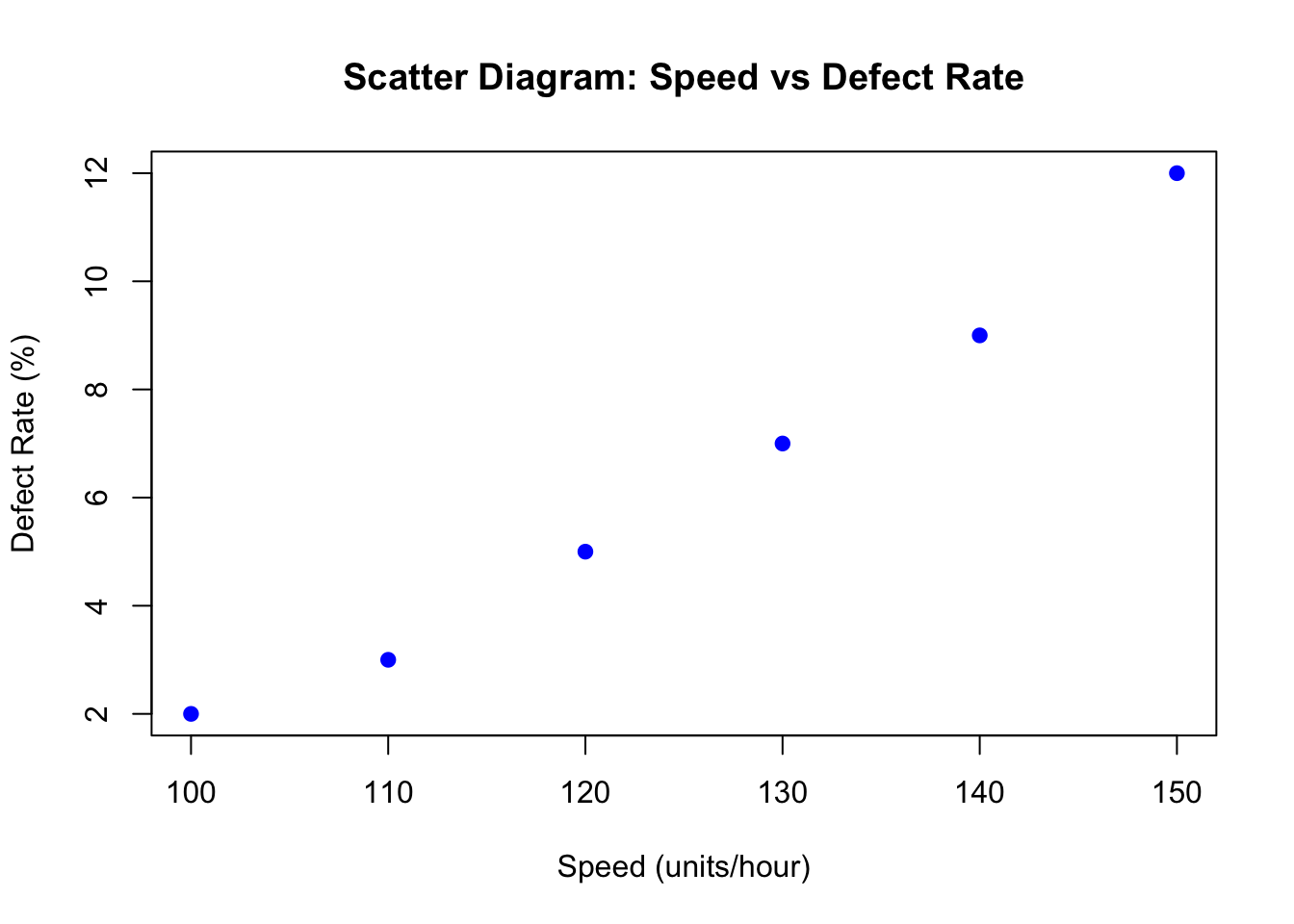
A machine’s speed setting (X: units/hour) and the defect rate (Y: % defective) were recorded:
| Speed (units/hour) | Defect Rate (%) |
|---|---|
| 100 | 2 |
| 110 | 3 |
| 120 | 5 |
| 130 | 7 |
| 140 | 9 |
| 150 | 12 |
Task: Plot the scatter diagram and interpret the results.
Answer & Interpretation
- The plot shows a positive correlation: as machine speed increases, defect rate also increases.
- Action: Management must balance productivity (higher speed) against quality (lower defects).
- Further steps: analyze root causes (e.g., heat, vibration at higher speeds).
4.7.2 Exercise 1
A packaging line records temperature (°C) and number of defects per batch:
| Temperature (°C) | Defects (per batch) |
|---|---|
| 20 | 2 |
| 22 | 3 |
| 24 | 4 |
| 26 | 6 |
| 28 | 8 |
| 30 | 11 |
Tasks for Students
1. Plot a scatter diagram of Temperature vs Defects.
2. Comment on the type of correlation observed.
3. Suggest one practical action based on the trend.
TipSolution
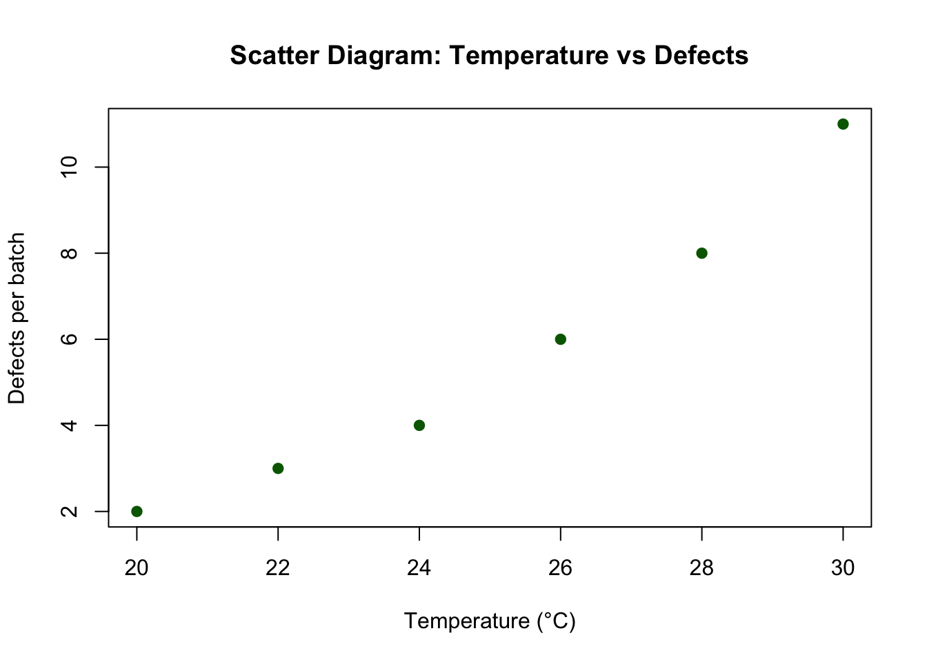
Answer & Interpretation
- Strong positive correlation: higher temperature leads to more defects.
- Practical action: control ambient temperature (e.g., install cooling, adjust machine parameters) to reduce defects.
4.7.3 Exercise 2: Machine Speed vs Defect Rate
A production manager suspects that the machine speed may affect the defect rate. The following data were collected:
| Machine Speed (units/hour) | Defect Rate (%) |
|---|---|
| 100 | 12 |
| 120 | 10 |
| 140 | 9 |
| 160 | 6 |
| 180 | 5 |
| 200 | 4 |
Tasks:
1. Construct a scatter plot of machine speed vs defect rate.
2. Comment on the relationship.
TipAnswer
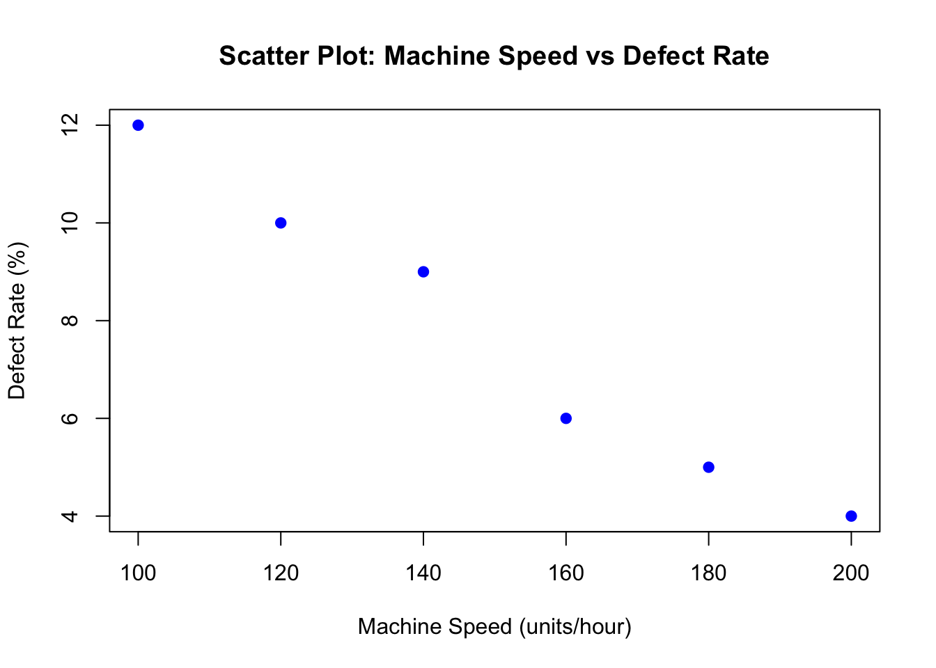
Interpretation
• As machine speed increases, defect rate decreases. • The relationship is negative correlation. • A fitted trend line (red) shows the downward pattern.
4.7.4 Exercise 3: Temperature vs Defect Rate in Production
In a semiconductor manufacturing process, engineers suspect that higher furnace temperature may increase the defect rate in wafers. The following data were collected:
| Furnace Temperature (°C) | Defect Rate (%) |
|---|---|
| 450 | 3 |
| 460 | 4 |
| 470 | 5 |
| 480 | 7 |
| 490 | 10 |
| 500 | 13 |
| 510 | 16 |
Tasks:
1. Construct a scatter plot of furnace temperature vs defect rate.
2. Comment on whether there is evidence of a positive correlation.
3. Suggest a control action that could be taken if temperature is found to strongly influence defect rate.
TipAnswer
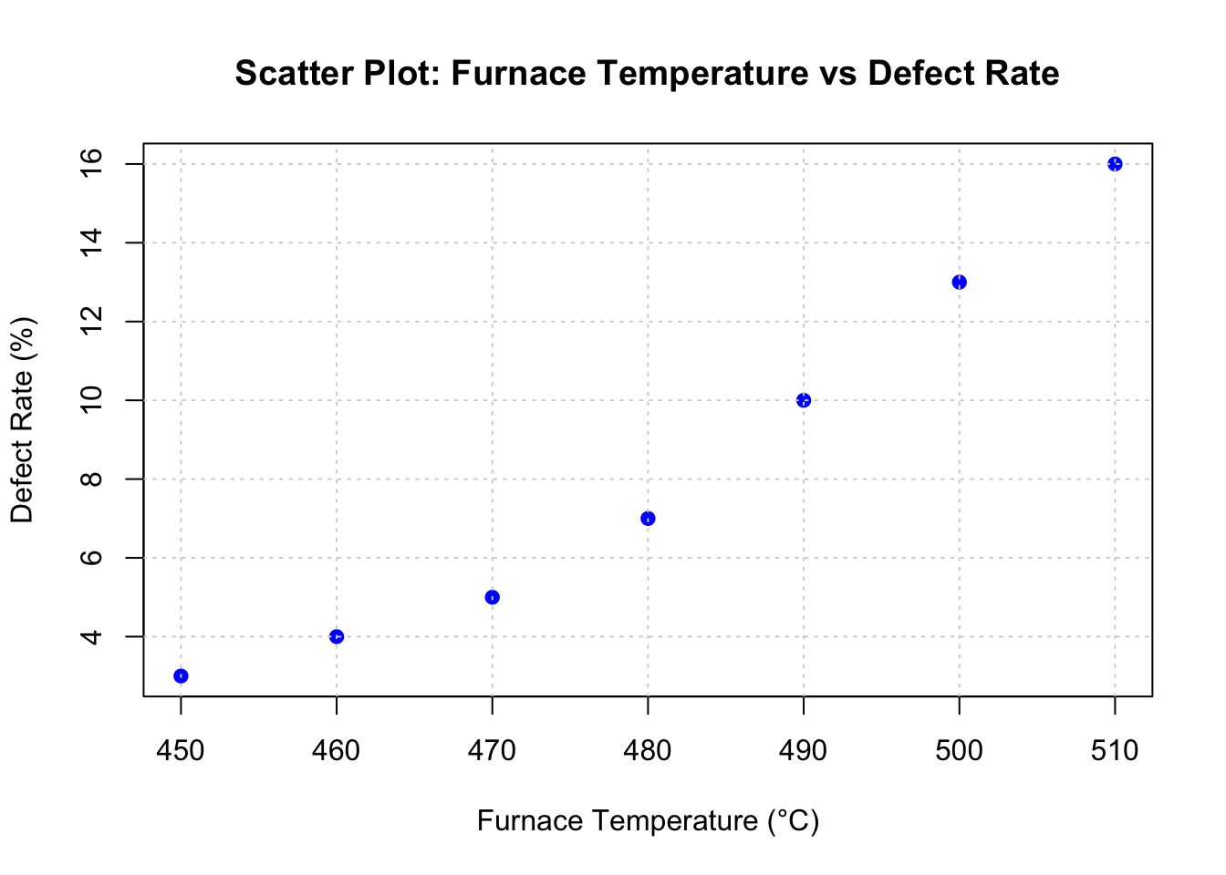
Suggested Answer
- The scatter plot shows a positive correlation: as temperature increases, defect rate also increases.
- This suggests that excessive heat damages the wafers.
- Control Action: Keep furnace temperature within an optimal range (e.g., below 480°C) using a control chart to monitor variation.
4.8 Control Charts
Control charts are one of the seven basic quality tools.
They are used to monitor a process over time and distinguish between:
- Common cause variation → natural, random variation inherent in the process.
- Special cause variation → unusual variation caused by specific, identifiable factors.
A control chart typically includes:
- A center line (average performance).
- Upper Control Limit (UCL) and Lower Control Limit (LCL) which represent the expected range of variation.
As long as data points fall within the control limits and show no unusual patterns, the process is said to be in control.
If points fall outside the limits or show trends/runs, this signals a potential problem that needs investigation.
Control charts are especially useful for:
- Tracking production processes.
- Identifying early signs of process shifts.
- Reducing variability and ensuring consistent quality.
Types of Control Charts:
- X̄–R Chart → Monitors sample means and ranges (continuous data).
- p-Chart → Proportion defective (attribute data).
- np-Chart → Number defective when sample size is constant.
- c/u-Chart → Count of defects per unit
4.9 Flow Chart
A diagram showing the sequence of steps in a process.
- Helps visualize the workflow, identify bottlenecks, and analyze process efficiency.
- Example: Steps in handling a customer complaint.