$Rbar
[1] 4.156

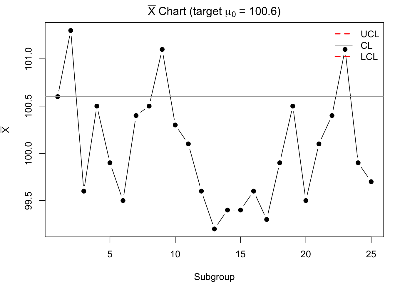
$Xbar_chart_limits
      LCL        CL       UCL
 98.20199 100.60000 102.99801

$R_chart_limits
     LCL       CL      UCL
0.000000 4.156000 8.785784 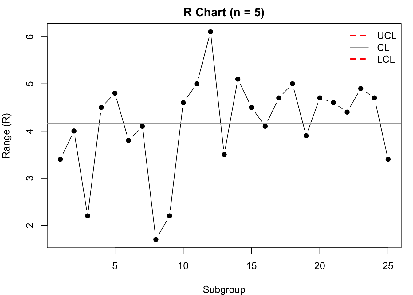
Variables data are numerical measurements taken on quality characteristics such as length (m), weight (g), resistance (Ω), viscosity, volume (ml), etc. The classic variable control charts are the \(\bar{X}\)-chart (process mean) used together with either the R-chart (range) or the S-chart (standard deviation).
Why variable charts are widely used:
Select characteristics that affect performance or customer requirements. Target points where statistical control will give timely and actionable feedback (e.g., critical dimensions, fill volumes, service times). Introduce control charts where they can reveal process information quickly to support corrective action.
Before charting, study the process to determine:
This analysis helps place charts where they detect problems early, and supports any needed process/equipment adjustments prior to statistical control.
Following Shewhart’s idea, form rational subgroups so that:
Typical practice: take consecutive items produced under the same short-term conditions to form each subgroup.
There is no single rule; choose based on cost and detection needs:
Collect initial data using the chosen (n) and frequency. Compute subgroup statistics (means, ranges or standard deviations) to estimate center lines and trial control limits.
Step 1. If needed, regroup historical individual observations into sequential subgroups of equal size (n) that satisfy rational subgroup criteria.
Step 2. For each subgroup \(i=1,\dots,k\), compute:
- Subgroup mean: \(\bar{X}_i = \frac{1}{n}\sum_{j=1}^n X_{ij}\)
- Subgroup range: \(R_i = \max(X_{ij}) - \min(X_{ij})\)
(or subgroup standard deviation \(S_i\) if using an S-chart)
Step 3. Compute:
- Grand mean: \(\bar{\bar{X}} = \frac{1}{k}\sum_{i=1}^k \bar{X}_i\)
- Average range: \(\bar{R} = \frac{1}{k}\sum_{i=1}^k R_i\)
- Average SD (if using S-chart): \(\bar{S} = \frac{1}{k}\sum_{i=1}^k S_i\)
Step 4. Layout \(\bar{X}\)-chart and R-chart (or S-chart): subgroup index on the horizontal axis; \(\bar{X}_i\) on the mean chart; \(R_i\) (or \(S_i\)) on the variability chart.
Step 5. Draw center lines:
- \(\bar{X}\)-chart center: \(\bar{\bar{X}}\)
- R-chart center: \(\bar{R}\) (or S-chart center: \(\bar{S}\))
Step 6. Compute and draw trial control limits using standard constants (depend on \(n\)):
Note. For small \(n\) (e.g., \(n<7\)), it is common that \(D_3=0\) or \(B_3=0\) so the lower limit of the variability chart may be zero (omit if negative).
Review trial charts: Investigate any out-of-control signals (points outside limits, runs, trends). If assignable causes are found, remove affected subgroups, recalculate limits, and adopt the revised limits for ongoing control.
When the process target/standard is known (e.g., \(\mu_0\)) and an estimate of variability is available:
Notes: Use tables of constants \(A_2, D_3, D_4\) for the chosen \(n\).
Setting. We wish to control a packaging process so that the target mean is
\(\mu_0 = 100.6\) g. We collected \(k=25\) subgroups of size \(n=5\); their subgroup means and ranges are listed below.
Data (subgroup means and ranges)
| Subgroup | Mean | Range | Subgroup | Mean | Range |
|---|---|---|---|---|---|
| 1 | 100.6 | 3.4 | 14 | 99.4 | 5.1 |
| 2 | 101.3 | 4.0 | 15 | 99.4 | 4.5 |
| 3 | 99.6 | 2.2 | 16 | 99.6 | 4.1 |
| 4 | 100.5 | 4.5 | 17 | 99.3 | 4.7 |
| 5 | 99.9 | 4.8 | 18 | 99.9 | 5.0 |
| 6 | 99.5 | 3.8 | 19 | 100.5 | 3.9 |
| 7 | 100.4 | 4.1 | 20 | 99.5 | 4.7 |
| 8 | 100.5 | 1.7 | 21 | 100.1 | 4.6 |
| 9 | 101.1 | 2.2 | 22 | 100.4 | 4.4 |
| 10 | 100.3 | 4.6 | 23 | 101.1 | 4.9 |
| 11 | 100.1 | 5.0 | 24 | 99.9 | 4.7 |
| 12 | 99.6 | 6.1 | 25 | 99.7 | 3.4 |
| 13 | 99.2 | 3.5 |
Step 1 — Compute \(\bar{R}\)
\[ \bar{R} \;=\; \frac{1}{k}\sum_{i=1}^{k} R_i \]
Step 2 — Choose constants (for \(n=5\))
These are standard Shewhart chart constants for \(n=5\). If your reference table differs slightly, use your course’s table.
Step 3 — Control limits
X̄-chart (target known): center at the target \(\mu_0\)
\[ \text{CL}_{\bar{X}} = \mu_0,\qquad \text{UCL}_{\bar{X}} = \mu_0 + A_2\,\bar{R},\qquad \text{LCL}_{\bar{X}} = \mu_0 - A_2\,\bar{R}. \]
R-chart:
\[ \text{CL}_{R} = \bar{R},\qquad \text{UCL}_{R} = D_4\,\bar{R},\qquad \text{LCL}_{R} = D_3\,\bar{R}\;=0\ (\text{for }n=5). \]
Step 4 — Plot & interpret
$Rbar
[1] 4.156
$Xbar_chart_limits
LCL CL UCL
98.20199 100.60000 102.99801
$R_chart_limits
LCL CL UCL
0.000000 4.156000 8.785784
Interpretation. If both charts are in control, the process shows only common-cause variation. Any point outside limits (or strong non-random pattern) suggests a special cause—investigate, correct, and (if confirmed) remove that subgroup and recalculate limits.
When \(\mu\) and \(\sigma\) are unknown, estimate from the preliminary subgroups:
R-chart limits (compute first): \[ \text{CL}_{R} = \bar{R}, \quad \text{UCL}_{R} = D_4\,\bar{R}, \quad \text{LCL}_{R} = D_3\,\bar{R} \] If the R-chart is in control, proceed to the \(\bar{X}\)-chart.
\(\bar{X}\)-chart limits: \[ \text{CL}_{\bar{X}} = \bar{\bar{X}}, \quad \text{UCL}_{\bar{X}} = \bar{\bar{X}} + A_2\,\bar{R}, \quad \text{LCL}_{\bar{X}} = \bar{\bar{X}} - A_2\,\bar{R} \]
If some points are out-of-control, investigate, remove subgroups with assignable causes, and revise the limits using the remaining subgroups.
Worked Idea (abbreviated)
- Check R-chart first. If all \(R_i\) are within limits, accept \(\bar{R}\).
- Use \(\bar{\bar{X}}\) and \(\bar{R}\) to compute \(\bar{X}\)-chart limits.
- If late subgroups (e.g., 18–20) are out of control, investigate; if causes found, recalculate limits excluding those subgroups.
Situation. In many cases, the process standard deviation \(\sigma\) is not known. Instead, we rely on the sample data (means and ranges) to estimate the process variability. Control chart limits are computed directly from the observed subgroup averages and ranges.
Step 1 — Collect sample data
Measurements of the outside radius of a plug. Four measurements were taken every half hour for a total of 20 samples.
Twenty subgroups of size \(n = 4\), with their means and ranges:
| Subgroup | Values (Radius) | Mean | Range |
|---|---|---|---|
| 1 | 0.1898, 0.1729, 0.2067, 0.1898 | 0.1898 | 0.0338 |
| 2 | 0.2012, 0.1913, 0.1878, 0.1921 | 0.1931 | 0.0134 |
| 3 | 0.2217, 0.2192, 0.2078, 0.1980 | 0.2117 | 0.0237 |
| 4 | 0.1832, 0.1812, 0.1963, 0.1800 | 0.1852 | 0.0163 |
| 5 | 0.1692, 0.2263, 0.2066, 0.2091 | 0.2028 | 0.0571 |
| 6 | 0.1621, 0.1832, 0.1914, 0.1783 | 0.1788 | 0.0293 |
| 7 | 0.2001, 0.1927, 0.2169, 0.2082 | 0.2045 | 0.0242 |
| 8 | 0.2401, 0.1825, 0.1910, 0.2264 | 0.2100 | 0.0576 |
| 9 | 0.1996, 0.1980, 0.2076, 0.2023 | 0.2019 | 0.0096 |
| 10 | 0.1783, 0.1715, 0.1829, 0.1961 | 0.1822 | 0.0246 |
| 11 | 0.2166, 0.1748, 0.1960, 0.1923 | 0.1949 | 0.0418 |
| 12 | 0.1924, 0.1984, 0.2377, 0.2003 | 0.2072 | 0.0453 |
| 13 | 0.1768, 0.1986, 0.2241, 0.2022 | 0.2004 | 0.0473 |
| 14 | 0.1923, 0.1876, 0.1903, 0.1986 | 0.1922 | 0.0110 |
| 15 | 0.1924, 0.1996, 0.2120, 0.2160 | 0.2050 | 0.0236 |
| 16 | 0.1720, 0.1940, 0.2116, 0.2320 | 0.2024 | 0.0600 |
| 17 | 0.1824, 0.1790, 0.1876, 0.1821 | 0.1828 | 0.0086 |
| 18 | 0.1812, 0.1585, 0.1699, 0.1680 | 0.1694 | 0.0227 |
| 19 | 0.1700, 0.1567, 0.1694, 0.1702 | 0.1666 | 0.0135 |
| 20 | 0.1698, 0.1664, 0.1700, 0.1600 | 0.1666 | 0.0100 |
Step 2 — Compute averages
\[ \bar{\bar{X}} = \frac{1}{k}\sum_{i=1}^{k} \bar{X}_i \]
\[ \bar{R} = \frac{1}{k}\sum_{i=1}^{k} R_i \]
Step 3 — Control chart constants (for \(n=4\))
(constants come from Shewhart tables for subgroup size \(n\))
Step 4 — Control limits
X̄-chart:
\[ \text{CL}_{\bar{X}} = \bar{\bar{X}}, \qquad \text{UCL}_{\bar{X}} = \bar{\bar{X}} + A_2 \bar{R}, \qquad \text{LCL}_{\bar{X}} = \bar{\bar{X}} - A_2 \bar{R} \]
R-chart:
\[ \text{CL}_R = \bar{R}, \qquad \text{UCL}_R = D_4 \bar{R}, \qquad \text{LCL}_R = D_3 \bar{R} \]
$Grand_Average
[1] 0.18956

$Avg_Range
[1] 0.1951

$Xbar_chart_limits
      LCL        CL       UCL
0.0473321 0.1895600 0.3317879

$R_chart_limits
      LCL        CL       UCL
0.0000000 0.1951000 0.4452182 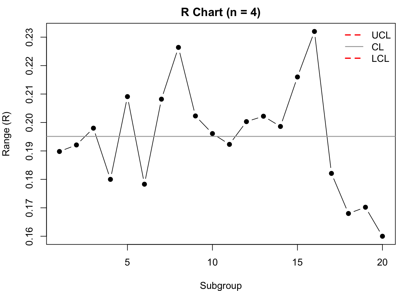
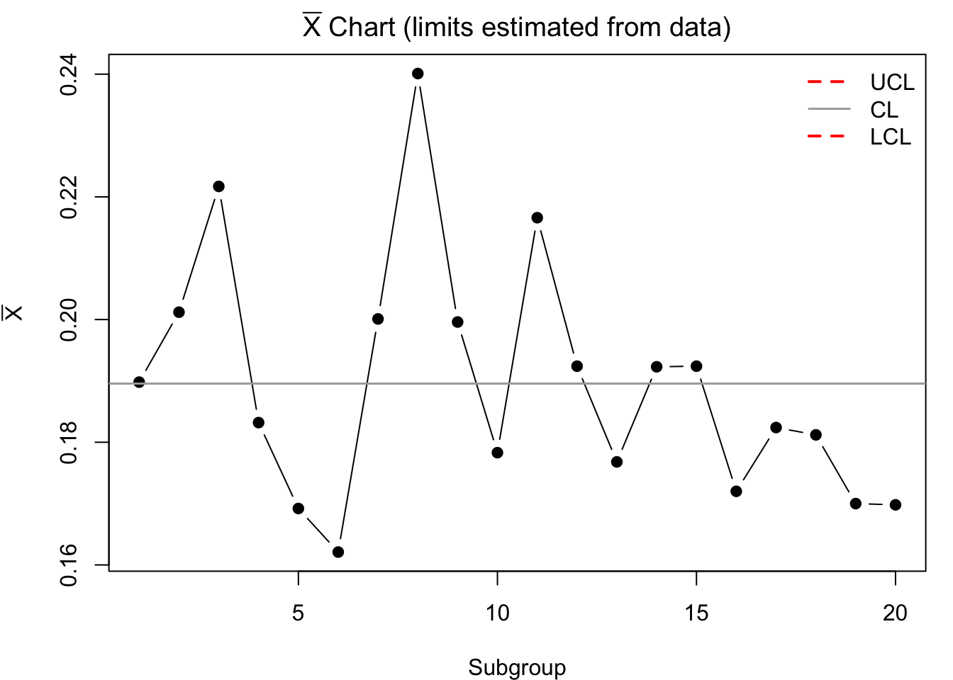
Step 5 — Interpretation procedure
TiW Layer Thickness (X̄–R and X̄–S)
Twenty subgroups of four substrates were measured (Å).
| Subgroup | X1 | X2 | X3 | X4 | R | Mean | Sd |
|---|---|---|---|---|---|---|---|
| 1 | 459 | 449 | 435 | 450 | |||
| 2 | 443 | 440 | 442 | 442 | |||
| 3 | 457 | 444 | 449 | 444 | |||
| 4 | 469 | 463 | 453 | 438 | |||
| 5 | 443 | 457 | 445 | 454 | |||
| 6 | 444 | 456 | 456 | 457 | |||
| 7 | 445 | 449 | 450 | 445 | |||
| 8 | 446 | 455 | 449 | 452 | |||
| 9 | 444 | 452 | 457 | 440 | |||
| 10 | 432 | 463 | 463 | 443 | |||
| 11 | 445 | 452 | 453 | 438 | |||
| 12 | 456 | 457 | 436 | 457 | |||
| 13 | 459 | 445 | 441 | 447 | |||
| 14 | 441 | 465 | 438 | 450 | |||
| 15 | 460 | 453 | 457 | 438 | |||
| 16 | 453 | 444 | 451 | 435 | |||
| 17 | 451 | 460 | 450 | 457 | |||
| 18 | 422 | 431 | 437 | 429 | |||
| 19 | 444 | 446 | 448 | 467 | |||
| 20 | 450 | 450 | 454 | 454 |
$Xbar_R
     LCL       CL      UCL
436.5496 448.6875 460.8254

$Rchart
    LCL      CL     UCL
 0.0000 16.6500 37.9953

$Xbar_S
     LCL       CL      UCL
443.1317 448.6875 454.2433

$Schart
      LCL        CL       UCL
 0.000000  7.621157 17.269542
[1] TRUE[1] FALSE[1] TRUE[1] FALSEInterpretation guide
• Check R chart first. If in control, proceed to X̄ chart using Rbar.
• For X̄–S, check S chart first. If in control, use Sbar for X̄ limits.
• If any out-of-control subgroups appear, investigate & remove those with assignable causes, then recompute limits.
When you prefer standard deviation over range (e.g., for larger \(n\) or better statistical properties):
(Averages and sample SDs given; compute \(\bar{\bar{X}}\) and \(\bar{S}\), then use \(A_3, B_3, B_4\) for \(n=5\).)
Procedure: Chart S first; if in control, compute \(\bar{X}\)-limits using \(\bar{S}\).
In an X̄–S control chart, each subgroup’s sample standard deviation \(s\) measures the within-subgroup variation.
For a subgroup of size \(n\) with observations \(x_1, x_2, \dots, x_n\):
\[ \bar{x} \;=\; \frac{1}{n}\sum_{i=1}^{n} x_i \]
\[ s \;=\; \sqrt{\frac{\sum_{i=1}^{n} (x_i - \bar{x})^{2}}{n-1}} \] - Use \(n-1\) in the denominator (sample SD).
Data: \(20.01,\; 20.03,\; 19.98,\; 20.02\) (mm)
Mean \[ \bar{x} = \frac{20.01 + 20.03 + 19.98 + 20.02}{4} = \frac{80.04}{4} = 20.01 \]
Deviations & squares \[ \begin{aligned} (20.01-20.01)^2 &= 0.0000 \\ (20.03-20.01)^2 &= 0.0004 \\ (19.98-20.01)^2 &= 0.0009 \\ (20.02-20.01)^2 &= 0.0001 \\ \sum (x_i-\bar{x})^2 &= 0.0014 \end{aligned} \]
Variance estimate \[ \frac{0.0014}{n-1} = \frac{0.0014}{3} = 0.000466\overline{6} \]
Standard deviation \[ s = \sqrt{0.000466\overline{6}} \approx 0.0216\ \text{mm} \]
MODE → STAT → 1-Var.DATA or M+).SHIFT → STAT (or 1) → VAR → σn–1 (label may be Sx, σn-1, or similar).Tip: On many Casio models: MODE → 3:STAT → 1:1-VAR, enter values, then SHIFT → 1 → 4:Var → select Sx.
=AVERAGE(B2:E2)=STDEV.S(B2:E2)Copy these formulas down for all subgroups to obtain \(\bar{x}_i\) and \(s_i\), then compute:
\(\bar{\bar{X}} = \text{AVERAGE of subgroup means}\) \(\bar{S} = \text{AVERAGE of subgroup SDs}\)
Use \(\bar{\bar{X}}\) and \(\bar{S}\) with constants \(A_3, B_3, B_4\) to set
X̄–S limits:
\[
\begin{aligned}
\text{S chart:}\quad &UCL_S = B_4 \bar{S},\quad CL_S=\bar{S},\quad LCL_S=B_3 \bar{S} \\
\text{X̄ chart:}\quad &UCL_{\bar{X}} = \bar{\bar{X}} + A_3 \bar{S},\;
CL_{\bar{X}}=\bar{\bar{X}},\;
LCL_{\bar{X}} = \bar{\bar{X}} - A_3 \bar{S}
\end{aligned}
\]
A precision manufacturer monitors the diameter of ball bearings produced on a CNC machine.
Each hour, a sample of size (n = 4) is taken, and the diameters (in mm) are measured.
The results for 12 subgroups are shown below:
| Subgroup | x1 | x2 | x3 | x4 | Mean | Sd |
|---|---|---|---|---|---|---|
| 1 | 20.01 | 20.03 | 19.98 | 20.02 | ||
| 2 | 19.97 | 20.00 | 19.99 | 20.01 | ||
| 3 | 20.04 | 20.05 | 20.02 | 20.03 | ||
| 4 | 19.95 | 19.96 | 19.97 | 19.94 | ||
| 5 | 20.00 | 19.99 | 20.02 | 20.01 | ||
| 6 | 20.03 | 20.05 | 20.06 | 20.04 | ||
| 7 | 19.98 | 20.01 | 19.97 | 19.99 | ||
| 8 | 20.07 | 20.06 | 20.08 | 20.05 | ||
| 9 | 19.92 | 19.94 | 19.91 | 19.93 | ||
| 10 | 20.02 | 20.00 | 20.01 | 20.03 | ||
| 11 | 20.04 | 20.07 | 20.05 | 20.06 | ||
| 12 | 19.96 | 19.95 | 19.97 | 19.94 |
Step 1. Compute subgroup means and standard deviations
$Xbarbar
[1] 20.00375

$Sbar
[1] 0.01432904
Step 2. Control chart constants
For subgroup size (n=4):
\(A_3 = 1.628\) \(B_3 = 0\) \(B_4 = 2.266\)
Control limits:
S Chart: \[ UCL_S = B_4 \bar{S}, \quad CL_S = \bar{S}, \quad LCL_S = B_3 \bar{S} \] X̄ Chart: \[ UCL_{\bar{X}} = \bar{\bar{X}} + A_3 \bar{S}, \quad CL_{\bar{X}} = \bar{\bar{X}}, \quad LCL_{\bar{X}} = \bar{\bar{X}} - A_3 \bar{S} \]
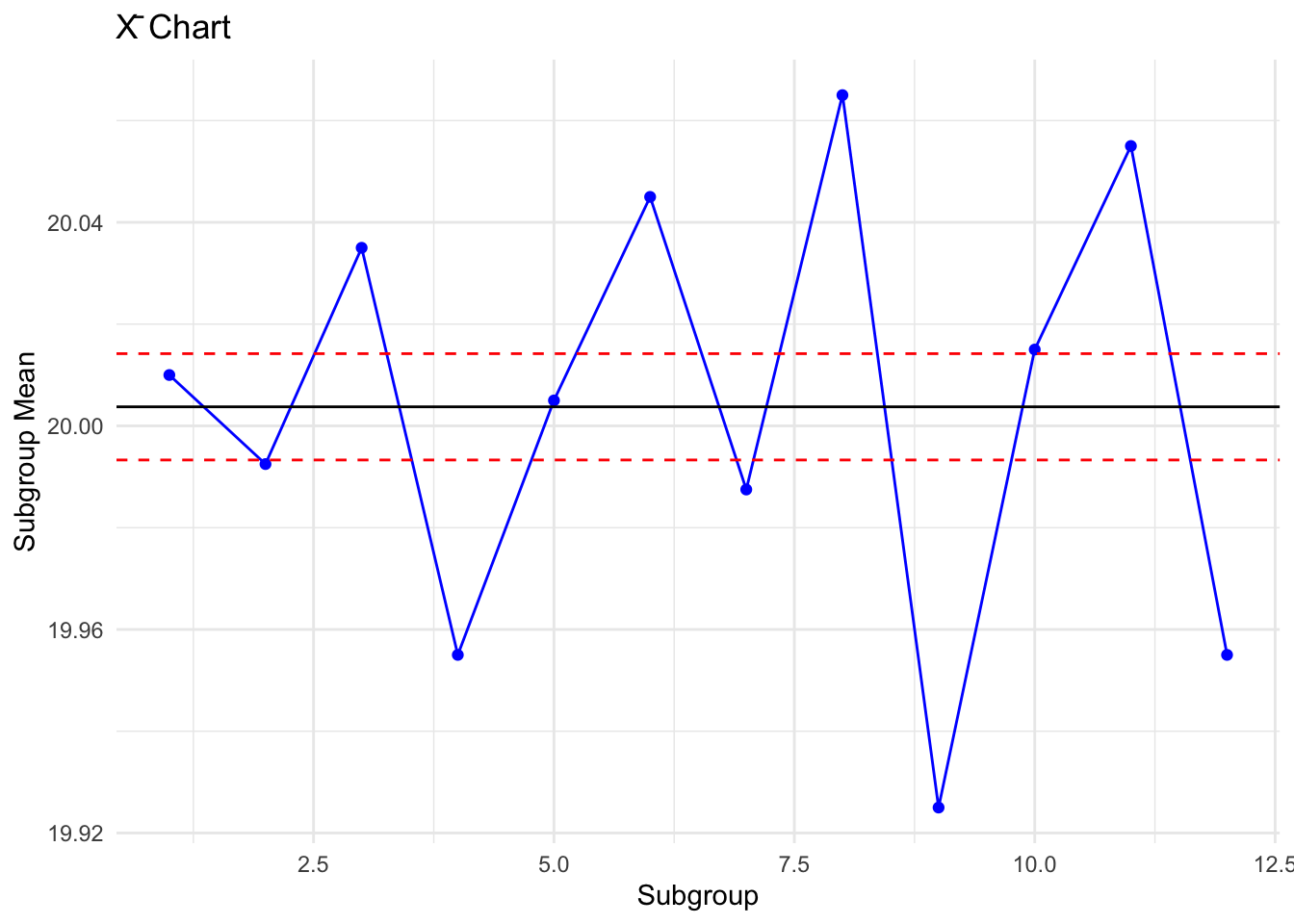
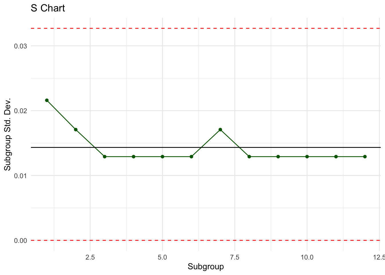
Step 5. Interpretation
• The S chart shows that variability within subgroups is stable, with no points beyond the limits.
• The X̄ chart also shows all subgroup means within the control limits, except subgroup 9, which is close to the lower limit.
• Overall, the process appears in statistical control, but subgroup 9 suggests a temporary disturbance.
A rolling mill monitors the thickness of aluminum sheets.
Every 30 minutes, \(n=5\) sheets are sampled and measured (mm).
The following data were collected for 15 subgroups:
| Subgroup | x1 | x2 | x3 | x4 | x5 | Mean | sd |
|---|---|---|---|---|---|---|---|
| 1 | 2.503 | 2.497 | 2.501 | 2.506 | 2.498 | ||
| 2 | 2.495 | 2.499 | 2.503 | 2.497 | 2.500 | ||
| 3 | 2.501 | 2.504 | 2.498 | 2.500 | 2.502 | ||
| 4 | 2.496 | 2.493 | 2.497 | 2.500 | 2.495 | ||
| 5 | 2.506 | 2.505 | 2.503 | 2.502 | 2.507 | ||
| 6 | 2.498 | 2.500 | 2.501 | 2.499 | 2.500 | ||
| 7 | 2.494 | 2.496 | 2.498 | 2.495 | 2.497 | ||
| 8 | 2.507 | 2.510 | 2.508 | 2.505 | 2.509 | ||
| 9 | 2.501 | 2.502 | 2.500 | 2.504 | 2.503 | ||
| 10 | 2.497 | 2.498 | 2.499 | 2.496 | 2.500 | ||
| 11 | 2.512 | 2.510 | 2.509 | 2.513 | 2.511 | ||
| 12 | 2.515 | 2.514 | 2.516 | 2.513 | 2.517 | ||
| 13 | 2.518 | 2.519 | 2.517 | 2.516 | 2.520 | ||
| 14 | 2.521 | 2.520 | 2.522 | 2.519 | 2.523 | ||
| 15 | 2.524 | 2.523 | 2.525 | 2.522 | 2.526 |
Exercise
[1] 0[1] 0.00408307[1] 0.001954557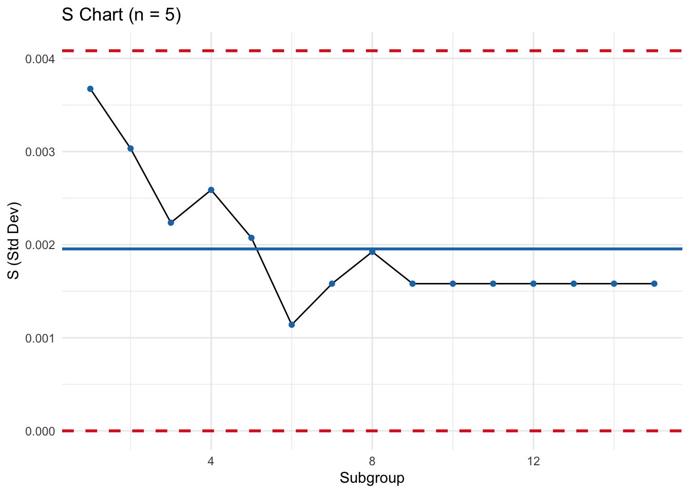
[1] 2.503478[1] 2.509056[1] 2.506267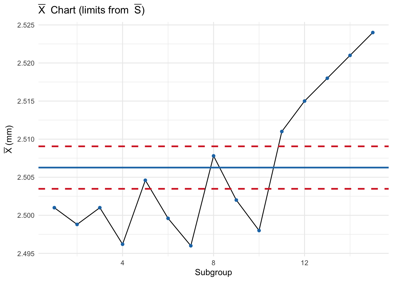
Interpretation (model answer)
• S chart: Most points are well inside the control limits → within-subgroup variability is stable (common-cause only).
• X̄ chart: From about subgroup 11 onward, the subgroup means move upward and approach the UCL, indicating a likely shift in process center (e.g., gradual calibration drift or roll pressure change).
• Action: Investigate settings/material from subgroup 11 onward. If a special cause is found and corrected, remove affected subgroups and recompute limits.
Compressive Strength (X̄–S)
Twenty samples of five parts each (psi):
| Sample | x1 | x2 | x3 | x4 | x5 |
|---|---|---|---|---|---|
| 1 | 83.0 | 81.2 | 78.7 | 75.7 | 77.0 |
| 2 | 88.6 | 78.3 | 78.8 | 71.0 | 84.2 |
| 3 | 85.7 | 75.8 | 84.3 | 75.2 | 81.0 |
| 4 | 80.8 | 74.4 | 82.5 | 74.1 | 75.7 |
| 5 | 83.4 | 78.4 | 82.6 | 78.2 | 78.9 |
| 6 | 75.3 | 79.9 | 87.3 | 89.7 | 81.8 |
| 7 | 74.5 | 78.0 | 80.8 | 73.4 | 79.7 |
| 8 | 79.2 | 84.4 | 81.5 | 86.0 | 74.5 |
| 9 | 80.5 | 86.2 | 76.2 | 64.1 | 80.2 |
| 10 | 75.7 | 75.2 | 71.1 | 82.1 | 74.3 |
| 11 | 80.0 | 81.5 | 78.4 | 73.8 | 78.1 |
| 12 | 80.6 | 81.8 | 79.3 | 73.8 | 81.7 |
| 13 | 82.7 | 81.3 | 79.1 | 82.0 | 79.5 |
| 14 | 79.2 | 74.9 | 78.6 | 77.7 | 75.3 |
| 15 | 85.5 | 82.1 | 82.8 | 73.4 | 71.7 |
| 16 | 78.8 | 79.6 | 80.2 | 79.1 | 80.8 |
| 17 | 82.1 | 78.2 | 75.5 | 78.2 | 82.1 |
| 18 | 84.5 | 76.9 | 83.5 | 81.2 | 79.2 |
| 19 | 79.0 | 77.8 | 81.2 | 84.4 | 81.6 |
| 20 | 84.5 | 73.1 | 78.6 | 78.7 | 80.6 |
$Schart
     LCL       CL      UCL
0.000000 3.795123 7.928013

$Xbar
     LCL       CL      UCL
77.14321 79.33300 81.52279
[1] TRUE[1] TRUEInterpretation
• If S is in control, then judge X̄ against its limits.
• Remove subgroups with assignable causes, recompute revised limits, and re-evaluate.
In many industrial processes, data are collected in subgroups of small size (e.g., 3–6 items per sample).
When the data are not normally distributed or when it is desirable to reduce the effect of extreme values, the median of each subgroup may be used instead of the mean.
The Median–Range chart \((\tilde{X}\)–R) is therefore an alternative to the traditional \(\bar{X}\)–R chart:
- The Median chart monitors the central tendency of the process.
- The Range chart (R) monitors process variability.
Why Use Median Charts?
When medians are preferred (robustness to outliers) with small \(n\):
Rule: Confirm R-chart is in control before finalizing median-chart limits.
Collect samples (subgroups) of size \(n\).
For each subgroup:
Compute the overall averages:
\[
\tilde{\bar{X}} = \frac{\sum \tilde{X}_i}{k}, \quad
\bar{R} = \frac{\sum R_i}{k}
\] where \(k\) = number of subgroups.
Determine control limits using statistical constants (similar to \(\bar{X}\)–R, but with adjusted factors for the median):
The constants \(A_4, D_3, D_4\) depend on subgroup size \(n\) and can be found in SPC (Statistical Process Control) tables.
Example (Conceptual)
Suppose a factory samples 5 items every hour and records their thickness (cm). For each subgroup:
- Compute the median thickness.
- Compute the range.
- Plot the medians on the Median chart and the ranges on the R chart.
- If all points lie within the control limits and show no unusual patterns → process is in control.
- If points fall outside limits or show trends/runs → investigate assignable causes.
Advantages
- More resistant to extreme values.
- Useful with skewed or non-normal data.
- Easy to explain to operators.
Limitations
- Less efficient statistically than the mean \((\bar{X})\) for normally distributed data.
- Not commonly used in automated SPC software (less supported than \(\bar{X}\)–R or \(\bar{X}\)–S).
Summary
- The Median–Range chart is an alternative to the \(\bar{X}\)–R chart when subgroup medians better represent the data.
- It provides robustness in cases of outliers and non-normal data.
- It should be used with small subgroup sizes and when simplicity is more important than statistical efficiency.
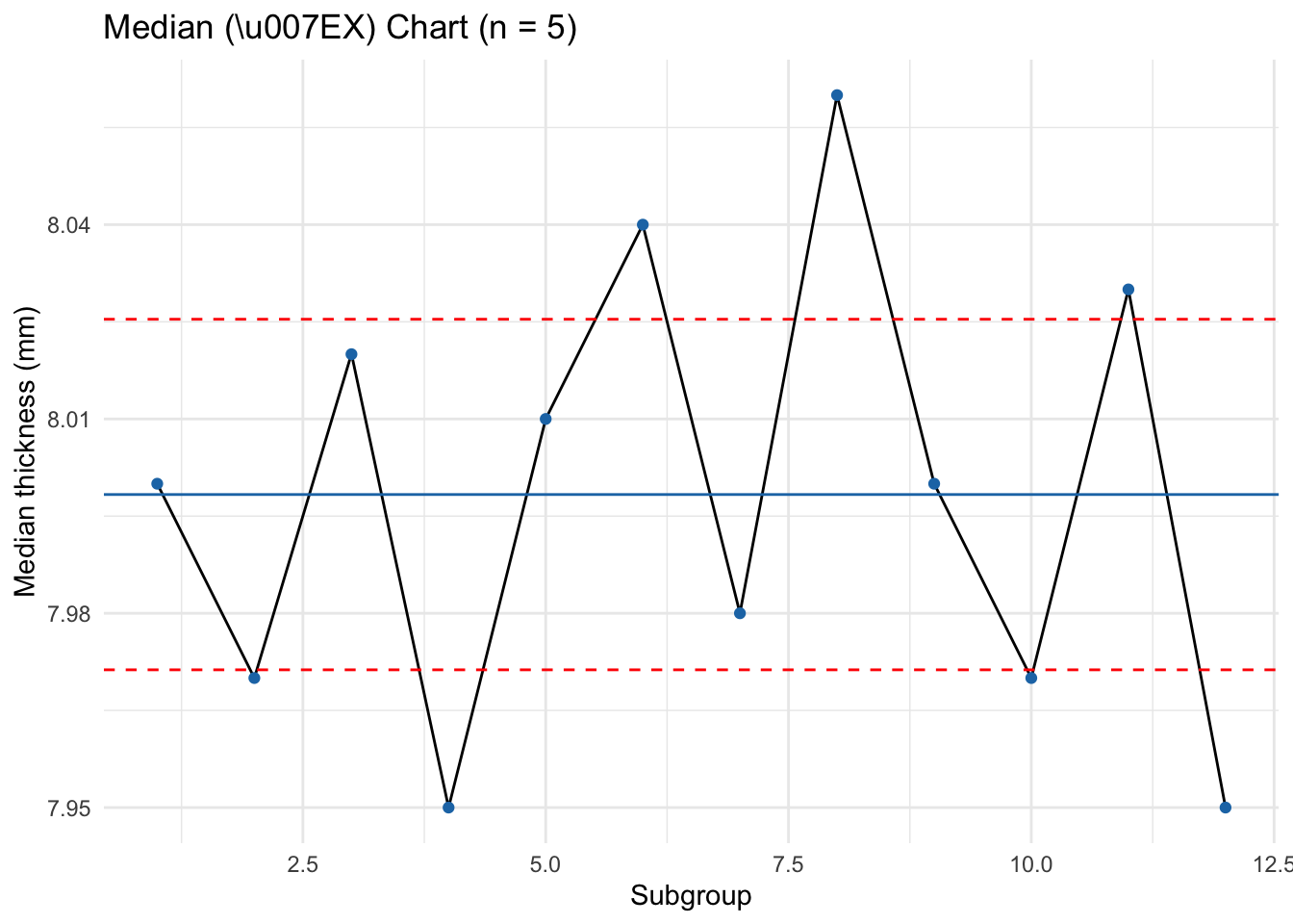
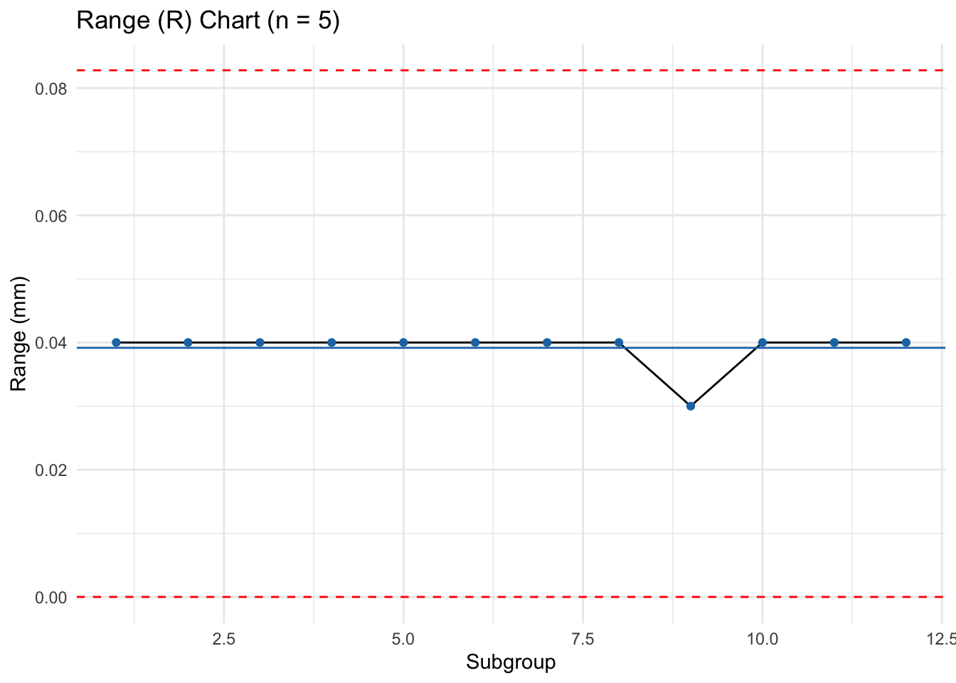
A machining cell produces a precision component. Every hour, \(n=5\) parts are sampled and their thickness (mm) is recorded. Data from 12 subgroups:
| Subgroup | x1 | x2 | x3 | x4 | x5 | Median | Range |
|---|---|---|---|---|---|---|---|
| 1 | 7.98 | 8.01 | 8.00 | 7.99 | 8.02 | ||
| 2 | 7.97 | 7.95 | 7.98 | 7.99 | 7.96 | ||
| 3 | 8.03 | 8.01 | 8.04 | 8.02 | 8.00 | ||
| 4 | 7.94 | 7.96 | 7.95 | 7.97 | 7.93 | ||
| 5 | 8.01 | 8.02 | 8.00 | 7.99 | 8.03 | ||
| 6 | 8.05 | 8.04 | 8.03 | 8.06 | 8.02 | ||
| 7 | 7.99 | 7.98 | 8.00 | 7.97 | 7.96 | ||
| 8 | 8.07 | 8.05 | 8.06 | 8.08 | 8.04 | ||
| 9 | 8.00 | 7.99 | 8.01 | 8.02 | 8.00 | ||
| 10 | 7.97 | 7.98 | 7.96 | 7.95 | 7.99 | ||
| 11 | 8.03 | 8.02 | 8.01 | 8.04 | 8.05 | ||
| 12 | 7.95 | 7.96 | 7.94 | 7.97 | 7.93 |
Task
1) For each subgroup compute the median \((\tilde X_i)\) and range (\(R_i\)).
2) Compute \(\tilde{\bar X} = \frac{1}{k}\sum \tilde X_i\) and \(\bar R = \frac{1}{k}\sum R_i\).
3) With \(n=5\) and (AIAG constants) \(\tilde A_2=0.691,\ D_3=0,\ D_4=2.114\), set control limits:
- Median chart: \(UCL_{\tilde X}=\tilde{\bar X}+\tilde A_2\,\bar R,\ CL_{\tilde X}=\tilde{\bar X},\ LCL_{\tilde X}=\tilde{\bar X}-\tilde A_2\,\bar R\).
- Range chart: \(UCL_R=D_4\,\bar R,\ CL_R=\bar R,\ LCL_R=D_3\,\bar R\).
4) Plot both charts and interpret.
Reference for constants:
AIAG/standard SPC tables for Median Charts (e.g., MIT “Tables of Constants for Control charts”: \(\tilde A_2=0.691\) at \(n=5, D_3=0, D_4=2.114\).
Interpretation (Model)
• R chart: If all ranges lie within \([0,\ UCL_R]\) with no unusual patterns → within-subgroup variability is stable.
• Median chart: If medians fluctuate around \(\tilde{\bar X}\) and stay within limits → process center is stable.
• Any point beyond limits or long runs/trends suggests special causes (tool wear, offset change, material lot, etc.).
Median–Range for Admission Times
A hospital monitors time to admit a patient (minutes). Subgroup size (n=3). Use median and range charts. Determine control lines and limits; plot on graph paper; comment on control and recommendations.
| Subgroup | X1 | X2 | X3 | Subgroup | X1 | X2 | X3 |
|---|---|---|---|---|---|---|---|
| 1 | 6.0 | 5.8 | 6.1 | 13 | 6.1 | 6.9 | 7.4 |
| 2 | 5.2 | 6.4 | 6.9 | 14 | 6.2 | 5.2 | 6.8 |
| 3 | 5.5 | 5.8 | 5.2 | 15 | 4.9 | 6.6 | 6.6 |
| 4 | 5.0 | 5.7 | 6.5 | 16 | 7.0 | 6.4 | 6.1 |
| 5 | 6.7 | 6.5 | 5.5 | 17 | 5.4 | 6.5 | 6.7 |
| 6 | 5.8 | 5.2 | 5.0 | 18 | 6.6 | 7.0 | 6.8 |
| 7 | 5.6 | 5.1 | 5.2 | 19 | 4.7 | 6.2 | 7.1 |
| 8 | 6.0 | 5.8 | 6.0 | 20 | 6.7 | 5.4 | 6.7 |
| 9 | 5.5 | 4.9 | 5.7 | 21 | 6.8 | 6.5 | 5.2 |
| 10 | 4.3 | 6.4 | 6.3 | 22 | 5.9 | 6.4 | 6.0 |
| 11 | 6.2 | 6.9 | 5.0 | 23 | 6.7 | 6.3 | 4.6 |
| 12 | 6.7 | 7.1 | 6.2 | 24 | 7.4 | 6.8 | 6.3 |
$Median
     LCL       CL      UCL
4.897083 6.212500 7.527917

$Range
     LCL       CL      UCL
0.000000 1.195833 3.078075
[1] FALSE[1] FALSENotes
• For median charts you’ll need median-specific constants. If your textbook table differs, use those values.
• Confirm R-chart in control first, then read the median chart.
The I–MR chart consists of two parts:
1. Individuals (I) Chart — monitors the process level using individual observations.
2. Moving-Range (MR) Chart — monitors process variability using the absolute difference between consecutive observations.
Control charts for individual measurements are used when:
1. Subgroup size \(n = 1\) (only one observation at a time).
2. Data collection is slow, expensive, or naturally occurs one at a time (e.g., chemical batches, daily measurements, machine calibration values).
Use I–MR when rational subgroups of size \(n>1\) are not feasible (e.g., slow batch processes, expensive tests).
MR chart: \[ \text{CL}_{MR} = \overline{MR}, \quad \text{UCL}_{MR} = D_4'\,\overline{MR}, \quad \text{LCL}_{MR} = 0 \] (For \(MR(2)\), \(D_4' \approx 3.267\).)
Individuals chart: \[ \text{CL}_{X} = \bar{X}, \quad \text{UCL}_{X} = \bar{X} + E_2\,\overline{MR}, \quad \text{LCL}_{X} = \bar{X} - E_2\,\overline{MR} \] (For \(MR(2)\), \(E_2 \approx 2.66\).)
Recommendation: If I–MR charts show out-of-control points, investigate special causes (raw materials, calibration, operator, environment) and remove affected points before revising limits.
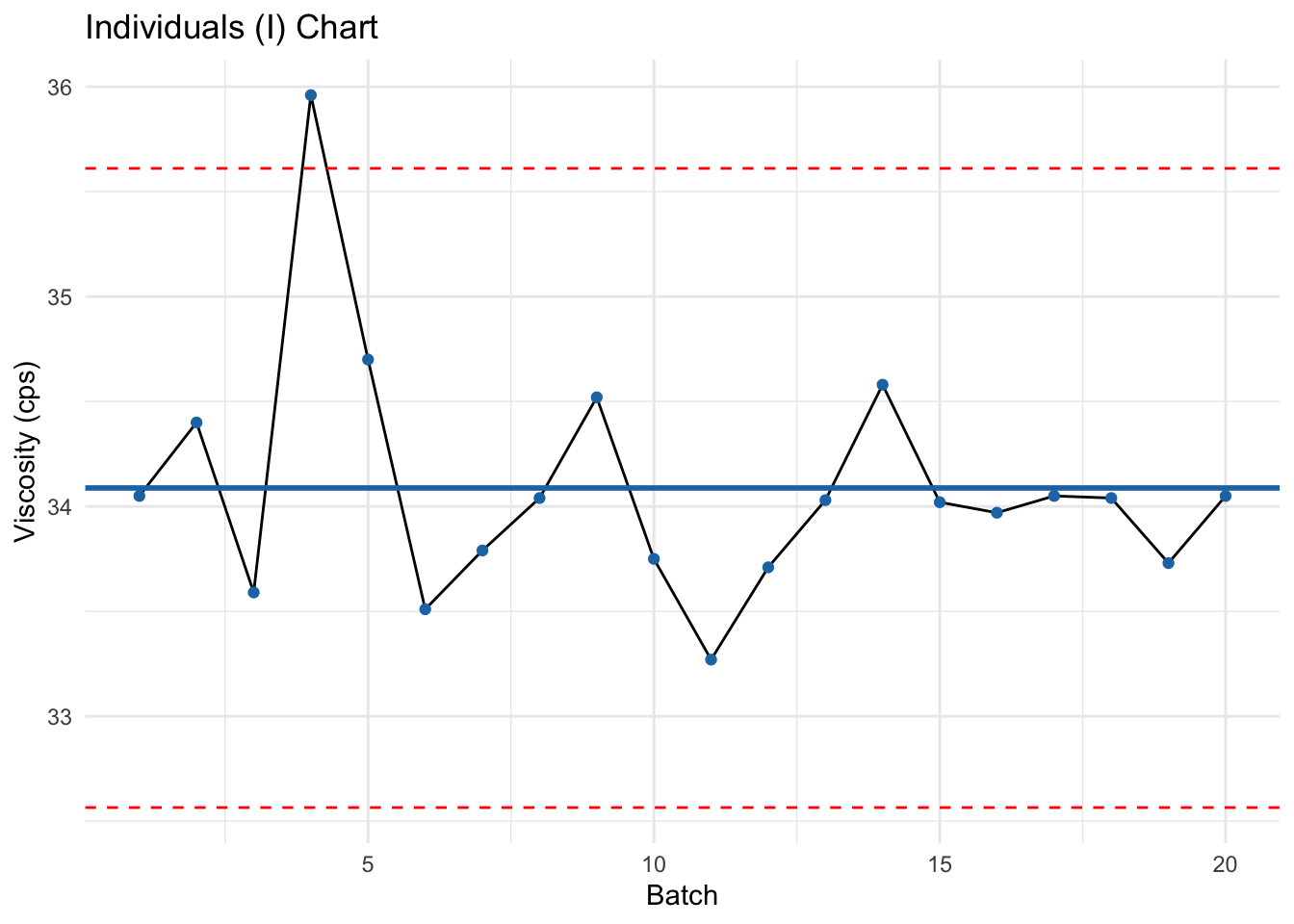
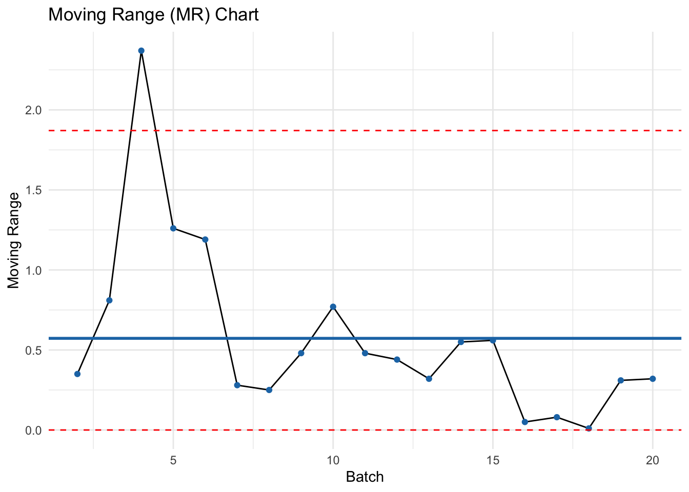
A paint manufacturer monitors the viscosity of aircraft primer paint.
Since each batch takes several hours to produce, only one sample per batch is available.
The viscosity (in centipoise, cps) of 20 consecutive batches is shown:
| Batch | Viscosity (cps) | Moving Range |
|---|---|---|
| 1 | 34.05 | |
| 2 | 34.40 | |
| 3 | 33.59 | |
| 4 | 35.96 | |
| 5 | 34.70 | |
| 6 | 33.51 | |
| 7 | 33.79 | |
| 8 | 34.04 | |
| 9 | 34.52 | |
| 10 | 33.75 | |
| 11 | 33.27 | |
| 12 | 33.71 | |
| 13 | 34.03 | |
| 14 | 34.58 | |
| 15 | 34.02 | |
| 16 | 33.97 | |
| 17 | 34.05 | |
| 18 | 34.04 | |
| 19 | 33.73 | |
| 20 | 34.05 |
Exercise
📘 Interpretation
• If all points fall within limits on both charts → process is in control.
• Points outside limits or patterns (runs, trends) → presence of assignable causes.
I–MR for Polymer Viscosity
Viscosity was measured hourly (last 20 hours):
| Test | Value | Test | Value |
|---|---|---|---|
| 1 | 2838 | 11 | 3174 |
| 2 | 2785 | 12 | 3102 |
| 3 | 3058 | 13 | 2762 |
| 4 | 3064 | 14 | 2975 |
| 5 | 2996 | 15 | 2719 |
| 6 | 2882 | 16 | 2861 |
| 7 | 2878 | 17 | 2797 |
| 8 | 2920 | 18 | 3078 |
| 9 | 3050 | 19 | 2964 |
| 10 | 2870 | 20 | 2805 |
Construct Individuals and Moving-Range charts. Assess control and recommend actions.
$MR
     LCL       CL      UCL
  0.0000 148.1579 484.0318

$X
   LCL     CL    UCL
2534.8 2928.9 3323.0
[1] FALSE[1] FALSEInterpretation
• Investigate any out-of-control MR first (sudden short-term shifts), then X.
• Typical assignable causes: raw-material lot change, recalibration, temperature/humidity shifts, operator change.
For typical subgroup sizes:
Use your preferred textbook/table for the exact constants; values above are typical references.